Original Logo and Collateral Package Designs
It's all about the Branding!
In viewing this portfolio you maybe confused as to why I chose to separate my samples of collateral packages and logo design from other computer generated artwork. This decision was guided by my Marketing Academic Background, continued reading/interest in Branding, and experience in design. The thought process and background knowledge/understanding needed for the creation of logos and collateral packages are more specialized; as designing even potentially successful collateral packages and logos is just as much a science as it is an art. A business's logo and collateral package are the defacto face they put out in the world. I know some people don't necessarily believe that a unique logo and/or collateral package has such an impact, and perhaps in the small business world the do it your own vistaprint method has its own merits; but consider this: as a society we are bombarded with information all day everyday and we retain less than 10% of it. Think about it how many logos do you see in a day? When it comes to new logos which ones do you remember? Often the things we remember are images/concepts that interest and resonate with us.
Graphic Design is not a Singular Entity
The aspect of generating Logos and Collateral within Graphic Design is heavily inter-connected with Marketing Strategies and Theories; the branding/re-branding of companies of every size and type is so important that it is included within most Marketing/Business Plans. If there is ever a time that a designer should take coupious notes regarding the project and the client's wishes, a branding project is that time. Creating a logo or contributing to a re-branding can be one of the most rewarding projects in which a Graphic Designer participates. That said the challenges presented in branding projects are unique to each situation. These issues can be comparatively more difficult than typical problems that arise in design work.
Logo Designs
Deborah Baird Fine Art Photography
Original
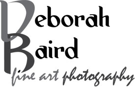
Deborah Baird Fine Art Photography Original Logo (2012)
The logo for "Deborah Baird Fine Art Photography" was my first Graphic Design commission opportunity. The client contacted me and requested a logo be designed for her sole proprietor photography business. It was a long distance collaboration so instead of sitting down together for an intial project meeting, she felt the best way to communicate what flavor we were after was to send me a few examples of other logos. Her tastes ran to the more utilitarian side of typographical-based logos. After brainstorming and coming up with some various concepts in a sketch book, I scanned in and sent the sketches for feedback and draft selection. The decision was to pursue one concept, which included an inter-locking "D" & "B,"utilization of implied line concepts and a second (likely script) font for the words "fine art photography." After the form was finalized and decisions about color were made the resulting logo is pictured at the top right.
Revision
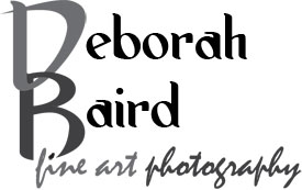
Deborah Baird Fine Art Photography
Version 2 (2013)
The logo pictured on the bottom is a recent revision. The revision was a result of inspiration by happenstance. I had not looked at the original logo design in some time, I happened to pull it up amoung a group of files to be optimized for web viewing and my fresh eyes saw something. Such things happen with artwork from time to time. Similar to finding an error in a paper you wrote three months ago, time away from a working peice reveals what you previously could not see. Before I had not considered the counter-balance effect of extending the curl of the "D" past the upright stroke. After revising the logo I sent a copy to the client, as it was her decision. She was thrilled with the change and will adopt it upon ordering new collateral.
The Jammin' Sisters
Jammin' Sisters Komen Group Logo
This is a pro-bono logo which I happily completed for a self-titled group the "Jammin' Sisters," who participate in at least one major Komen™ Walk for Breast Cancer every year. The two principle members of this group were a cancer survivor and her sister were initially unsure of what exactly they wanted in a logo. So like many designers in such a situation I decided to just have a talk to find out where the unique logo idea came from. The sisters shared pictures of past walks, told me stories, and discussed the evolution of the group name with me; the jammin' aspect was based in the names of their daughters who had the initials J, A, and M. So having heard the story, it was just me and my sketchbook. It didn't take long to occur to me that I should not go away from the traditional ribbon, rather make it unique and personalize it to their story. Well one can fill a sketchbook with uniquely shaped ribbons, but I was not happy with just a new shape of ribbon. I found gold upon not only integrating the story of the daughters initials, but featured the initials of the two sisters...and worked with them on branding.
Visionary Woodworks Logo
The logo featured here was designed for a local carpenter who specializes in various styles of wood furniture design. Due to a certain amount of creative understanding, I was essentially given free-reign in idea and concept generation.
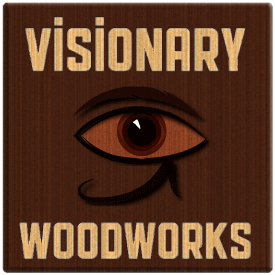
Visionary Woodworks Logo featuring the use of Wood Grain and the Egyptian Eye of Ra
As I thought of various concepts, it was important to me that I avoid all of the clichè concepts one often finds in the hardware/carpentry industry. There could not have been any greater insult to this individual's skills than had I presented him with a sketchbook full of tacky fonts, triangular squares, saw blades, and hammers.
This logo was meant to represent the very essence of his work which is truly anything but ordinary. Early in this conceptualization I knew the logo would miss if it did not feature an eye, and prominently at that. The challenge became how I was going to execute the design, give the eye the depth one associates with the word "visionary," keep it related to carpentry, and stick to the golden rule of keep it simple stupid.
Eventually, following some experimentation with various ideas within Illustrator the solution became apparent, the various grains I created along with some other effects created the necessary depth. The Eye or Ra was incorporated at the suggestion of another individual during my revisionary process, as it is an archetypal symbol of what it is to be visionary. Both myself and my client were very satisfied with the design outcome, I particularly found it rewarding to tackle something in a new arena.
The North Carolina Office of State Personnel
Creating logos for re-branding the North Carolina office of State Personnel was simultaneously an assignment for a course at Wake Tech, as well as the opportunity to participate in a "real-world" design problem. A document created by a representative of the State, this document requested a series of logos be designed, each of which would be considered for use by the Office of State Personnel. The document detailed a number of specifics which the finished logo design(s) should communicate and solve a myriad of things all at once.
Click to Enlarge
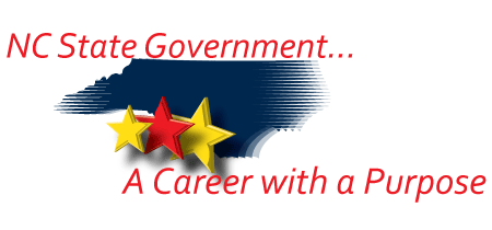
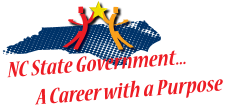
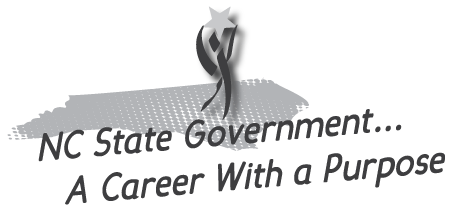
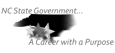
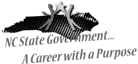
The State Office of Personnel seemed to have a tall order for a logo; which by definition should be simplistic. With an inability to contact the client for streamlining and clairification, I decided to focus on the concepts that were most emphasized, and would work together in the creation of a design. The largest goal was: that the logo be unifying and applicable to all North Carolina State employment positions. There was also great deal of emphasis placed on the design attracting a younger audience, while not losing the existing more mature audience. Therefore in addition to focusing on "the largest goal," I focused on the to expand the current target audience to include the younger demographic by creating designs with a reserved modern appearance.
Flavors
Flavors is the Wake Technical Community College On-Campus Culinary Program Lab that also functions as a Restaurant. The logo design and door frosting design was another assignment in which the design students were tasked with real-world design projects. As the head of the culinary department was seeking a new logo to make help Flavors feel more like any other restaurant. The logo was to primarily be used on the menus, and for advertisment purposes; there was a limitation that the designs could feature one color in addition to standard black and white.
Click to Enlarge
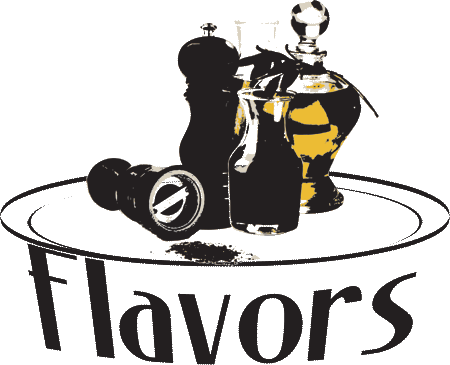
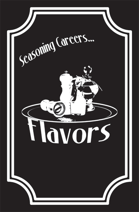
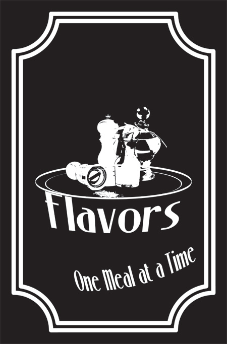
I recall feeling a bit stumped for this design problem initially. A one word name, a short word one at that, and the department head didn't give much to go on. So instead of trying to make a logo fit anything and everything, this was an instance of getting over the hurdle of finding an idea that seemed right by virtue of the situation. As I considered the design in my planning I wrote down in large letters one removable color, and door frosting; I did this to ensure that my ideas would fit the intended use. My final designs are featured here, logo and door frosting.
Logos with Collateral Packages
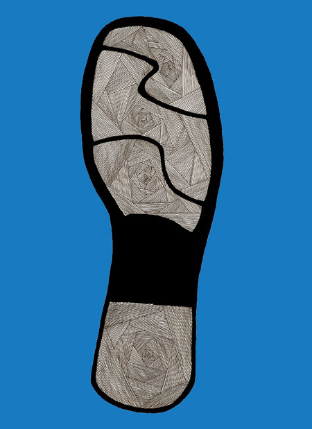
City Motions
The logo design, branding slogan, and collateral package creation for "City Motions" were an assignment for a course at Wake Technical Community College. Before we were to design anything, each group was to reach a concensus regarding the specifics of a company its product. My group was assigned task of agreeing on the specifics of an imaginary shoe company; once the specifics were settled we were to go our separate ways to commence with limited computer use, designing a logo, collateral package, and product packaging.
Click to Enlarge
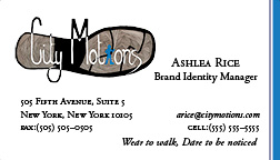
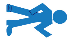
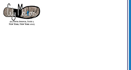
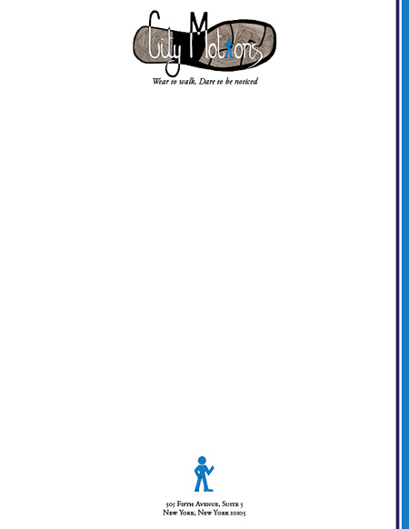
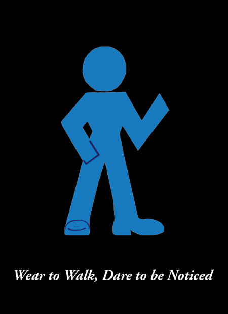
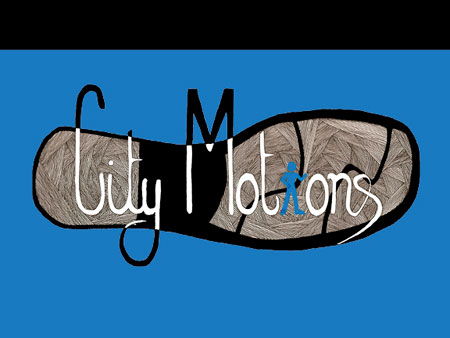
Often a business entity's name and branding is somewhat influenced by the product of said business. Therefore instead of trying to brainstorm for a shoe company name to fit all shapes and sizes, it was agreed the group should agree on what niche of the shoe industry this company would be a part. Once the focus was narrowed to the fashionable, dress shoe niche, eventually the name "City Motions" was decided upon. The reasoning behind this title was first and foremost that there was a great deal of latitude and design possiblities for each group member to be completely unique and separate from one another; additional inspiration/reasoning was that fashion is traditionally associated with the Metropolitian City concept, and often a lot of the motion within a city is walking...the result: "City Motions."
In my design concepts for City Motions, I took inspiration from common aspects of any Methropolitan area: high rises, a certain degree of attitude, controlled chaos, and of course movement. The biggest inspiration for me however was the ever powerful walk/don't walk sign, as I found myself focusing on the fact that walking was the source of the motion, but the walk sign/ don't walk signs regulate it and initiate it. As a result I incorporated a walk sign with some attitude to it within my logo. The bonus aspect to this type of logo incorporation is that the company utilize the design as a whole, text only with the figure, or even pull the person figure to represent strictly in a pictoral manner. The designs include a business card front/back, envelope front/back, letterhead, shoebox top, shoebox bottom, and box front.
Fingerprint Designs
As I mapped out the structure of this Fingerprint Designs Studio site, it occurred to me that this page would be lacking if I did not include my own Fingerprint Designs collateral. The creation of this collateral was an interesting exercise in being one's one client, I was my own client in creating a logo it was not as challenging as designing the collateral. The logo probably came with greater ease because a logo is the representation of something/someone essentially an identity. Whereas collateral is to function as a personalized tool to communicate professionally, while also including a logo, and be an extension to that identity.
Click to Enlarge
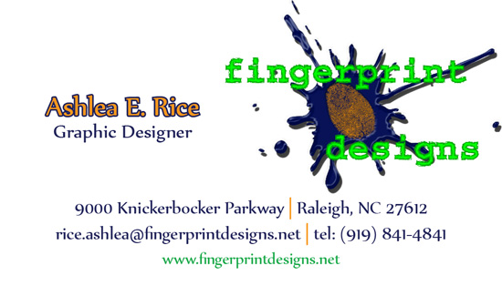
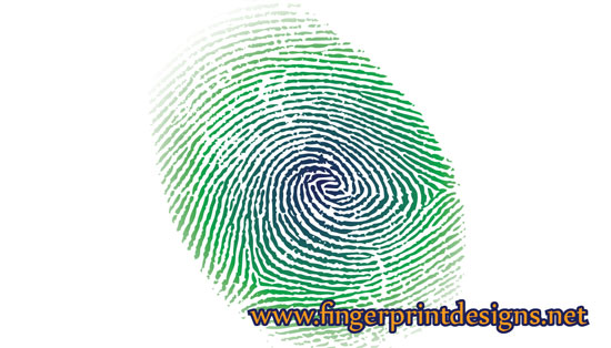
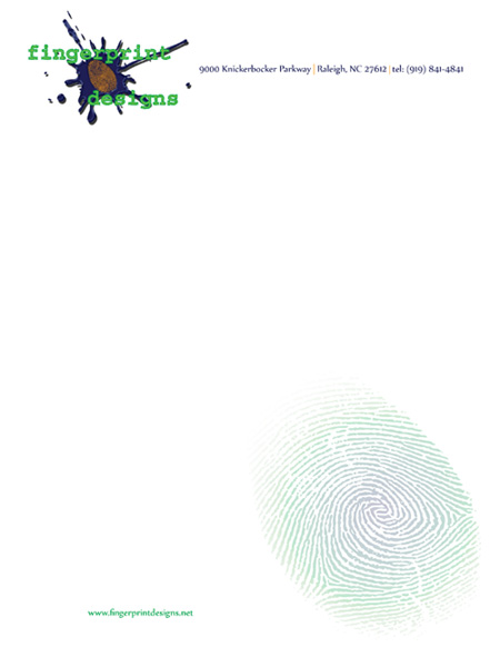
In the creation of my collateral, I thought it best utilize the greens, orange, and blue featured in my logo to maintain a unified appearance. My goal in the creation of the Fingerprint Designs Collateral Package was to find the delicate balance between the "creative look" and the "corporate look," maintaining an air of professionalism without being too staight laced. Similar to the "City Motions" logo above, the fingerprint designs logo has the benefit of featuring elements that can be utilized independently to represent the brand. In my collateral package designs I took advantage of the flexibility of the various elements and incorporated them.
Note:
As this is the internet and one should be reluctant regarding any personal information, while these peices are my collateral package, the information they contain is false; information only included to illustrate the complete design.