Computer Generated Concepts
Designing without Limits
Unique Perspective
Being an older member of Generation Y, I am keenly aware of how far technology has really come in the past 25 years. Those in their late twenties have had the fortune of having a unique relationship with technology. These individuals are old enough to remember some relatively low tech days, while also being young enough to take on the digital age with ease. I remember the times of the bag cell phone, Prodigy, Duck Hunt, the introduction of the Discman, and the first time my father and I successfully got America Online to work. For those such as myself it seemed like computer technology grew up right along with us. The result: we older Gen-Yers had the benefit of being the first generation to grow up using computers and programs that once could only be dreamed of...while also simultaneously having the context to appreciate and understand how much technology has changed the world.
Technology and Design
During this same time during which I "grew-up," the designer went from being an "Industrial Designer" to a Graphic Designer/Artist. Adobe programs have gone from complicated to use with limited results, to the Adobe Creative Suite which essentially allows the designer to design without limits with cross-program compatibility. I have experience and am proficient with both the Design Creative Suite 4, and Design Creative Suite 5; as a graphic designer I believe one can always find something new to programs such as these because they truly are limitless.
New Product Advertising Campiagn
Graphic Design Skills with Advertising and Copywriting
Graphic Designers can easily be considered "renaissance people" of sorts, not only are there multiple applications of the skills involved, but there is a wide arena in which these applications are considered beneficial. The official conerstone of Graphic Design is Advertising, as the concept originated from the Industrial Designer position in which the designer created pieces in the "old school" pre-digital method. As advertising can be a major aspect of a Designer's career
Click to Enlarge
These pieces were created in the context of an advertising campaign for a new product launch. The product I had chosen for my "semester product" some weeks earlier, was the Kinsei 3 produced by the ASICS shoe company. Each piece was created with various presentation media/methods in mind.
Details of the ASICS™ Campaign Pieces
- Nature: Enhanced.
- Going Soft
- Comparision Approach
- Getting Emotional
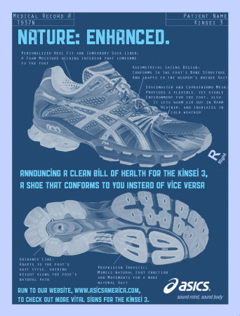
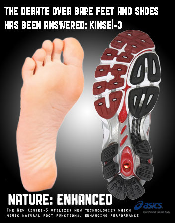
The objective of the campaign advertisement on the far right was: to communicate with and educate the potential consumer about specific benefits and/or features of that one particular product. This information is meat to provide "evidence" as to why said product is at least worth consideration. Communicating with potential consumers is to build (or re-establish) a relationship, which can impact the short-run (1 sale) and the long-run (brand loyalty). To deliver a visually striking design while also fulfilling the objective, I created an x-ray themed ad. The idea gelled nicely for the purpose of pointing out features both inside and out. The ad was requested to be effective in two different sizes, a large in-store poster and a full page magazine ad.
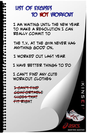
The ad to the immediate left of center was created with post-modern soft sell techniques in mind, the goal being to create an advertisement which initially doesn't really seem to be an advertisement at all. These ads are best placed within industry relevent publications, for example Runner's World would be an industry relevent publication for ASICS. To meet the objective of this design I placed the main focus on a tongue-in-cheek list of justifications not to exercise and marginalized the branding elements, while formatting creatively so as not to be overlooked.
The first ad to the right is a "two-fer" contrast advertisement. This approach to advertising takes advantage of the inherent human instinct to comprehend the nature of things through contrasting comparision. (For example, there is no comprehension of "wholeness" without the converse "emptiness") In taking advantage of this instinct to be placed in various publications, dailies mostly.
The ad on the far right was designed to be a half page ad or card stock hand-out with an emotional appeal to the potential consumer. Designing an emotionally appealing ad for an inanimate object like running shoes can easily be made more difficult than the reality of the task; I overcame this hurdle by focusing on what the product offers, how the consumer might benefit, and the potentional resulting emotions from that experience.
Theme Posters
Cross Program Work within The Design Suite
Click to Enlarge
As the Adobe Software Suite concept has evolved, artists have been presented the opportunity to maximize the strengths of each individual program. This practice of working "across the suite" benefits the overall design appearance...which of course results in a benefit to the client. Within the Design Creative Suite 5, the big players are Dreamweaver, Photoshop, Illustrator, InDesign, Fireworks, and Flash. In recent versions of the suite Adobe has included and improved Bridge and its CameraRAW funtion, which as the name implies can be utilized as a bridge between the programs. Once a designer is comfortable and knowledgable in their use of the Suite, they are no longer hampered by the capabilities of a single program as they understand how, where, and potentially when (within the creation process) each element should be developed. One such example is that the Fingerprint Designs Logo is a multi-program creation.
Theme Poster Details
- Typography Jones
- Picture of Words
- Combining an Image with Words
- Narrative Piece
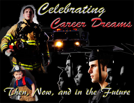
- Career Dreams
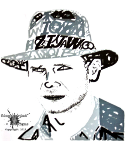
The first piece is a representation of Harrison Ford as Indiana Jones during The Last Crusade. Photoshop and InDesign were utilized in the creation of this piece. I found the image of Ford on set downloaded, and opened it in Photoshop. Within Photoshop I heightened the appaeance of light and shadows to be easily visible. Utilizing the modified photo within InDesign I generated a Harrison Ford likeness with letters in the Indiana Jones style font.
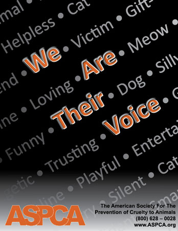
This is the first in a series of three posters for the ASPCA, each of which revolves around the ASPCA branding We are Their Voice. To avoid making light of the ASPCA mission, I kept the amount color down (using only ASPCA orange), and was minimalistic in other design decisions. This first poster merely utilizes the branding and other pet descriptors to form the concept. This approach stays in tune with emotions while still being dynamic enough to catch attention.
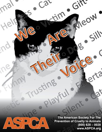
This second ASPCA poster utilizes the same textual formatting as the previous, with a close-up of a cat as the background. This combination takes advantage of the positive aspects of the dynamic text, and compenstates for the lack of pictoral representation. This pictoral representation allows for a view to understand instantaneously who "their" refers to within the branding. Also depending on the viewer this version may be more successful in stirring emotions.
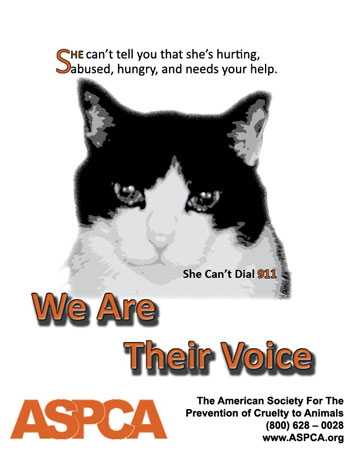
This last ASPCA poster would be considered an emotional narrative piece, as it is meant to make the emotional importance of We are their Voice apparent. Instead of making use of dynamic text, this approach to the topic slows everything down to draw focus. You will notice like the previous two posters, the third mantains a minimalistic simplicity...which assists in directing the solemn implications behind the branding
Designing for Print and Web
Considering the Intended Use
Click to Enlarge
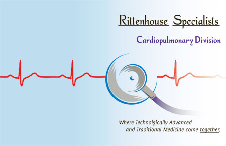
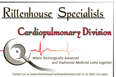
A major consideration throughout the design process is for what purpose has the client asked the designer to design. While printing may seem a thing of the past at times, it will never die. Therefore it is important to consider: is the element being designed destined for print, web, or (more frequently) both? There are a lot of aspects a Graphic Designer must consider to achieve the best results for a client. Often a client will need a project to cover a multitude of applications, in which the designer has to carefully match on screen color to printing color.This group of finished designs were designed supposing one such example in which the client needs a design for various applications.It is for a theoretical medical company and the logo design is original and property of Fingerprint Designs.
Design Intended Use Specifics
- Folder-folio
- Newspaper Ads
- Web Banner
In this senario, amongst the requirements was a three-color (in addition to black) Pantone gloss folder or booklet cover. The piece appears as it would in going to the printer, back to front. In final form it would be folded, so only the edge of the light blue gradient would be visible on the front cover.
The second aspect of this graphic design package was a Newspaper advertisement which utilized one CMYK color in addition to the application of Black. I chose to utilize red as it shows well on Newsprint and many tints/shades of red are associated with medicine. Due to the printing quality of newspapers I also sought to give only the information needed paired with a simple use of the logo graphics.
The third and final piece is the web banner. As I mentioned above there are various concerns/settings a designer must address before they design anything, this statement holds true to items such as web banners as well. Size, resolution, and the color palettes are examples of such concerns. Designing web banners can be a unique challenge as often-times they are long and narrow, therefore the designer must be strategic in their use of space while being conscious of legibility and readability. In this instance I made use of the negative space within the stethoscope logo to place the branding line. Using this space avoided a cluttered appearance and enabled a good use of white space.
Strictly Illustrator
The Name says it All
The Adobe program titled Illustrator is aptly named, it more than any other Adobe program is meant to be a computerized method of Illustrating amoung other things. One major aspect of Illustrator is that the designs created within the program are based on vectors (mathematic equations).
Click to Enlarge

A design consisting of vectors provides the benefit of flexibility as the piece can be resized as desired without becoming pixelated. Illustrator is the go to program for creating something from nothing. It combines all those expensive art tools and media of the traditional illustrator into a digital package. While I haven't left traditional artistic tools and methods behind, the benefits and capabilities of Adobe Illustrator are not lost on me.
A designer may utilize Illustrator to create more than a wide variety of artistic peices, Illustrator is limited only by the artist's imagination. These few peices are not the only works I have created in illustrator, they are just pieces that were completely created within the program, and are not peices that are a part of a larger series or project.
Illustrator Piece Descriptions
- Dreamer
- Regain your Freedom
- Yummy
- The Great Within the 58
- Magnifying Glass
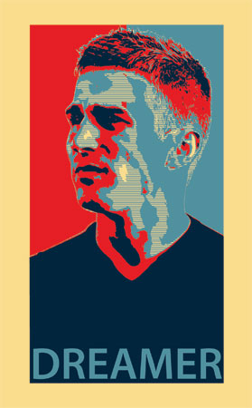
You may recognize my "dreamer" poster to share a similar style and appearence to a certain famous campaign poster. Viewed individually each layer of color would seem completely random, however viewed together a portrait is visible. This type of artwork demonstrates the desire within the human mind to see and comprehend more...such as patterns. In working within Illustrator I have found achieving such abstract designs is only one strength of the program.
The "Regain Your Freedom" graffitiesqe piece was meant to be a hip shoe ad for shoes similar to Vibram's Toe-Shoes. It is meant to appeal to a demographic which heavily includes twenty and thirty-somethings with an adventurous, active and mellow lifestyle. To catch the attention of and appeal to that group I utilized Illustrator grunge brushes and tools, attempting to convey a great deal of motion simplistically.
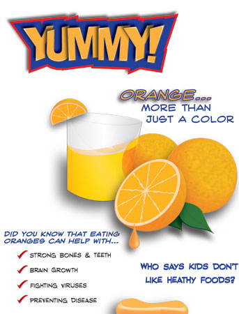
The next rendering is a poster meant to for the family audience to encourage healthy choices for children; in this problem the audience was more challenging to target with my design as the targhet audience was both parents and their children. To reach both audiences I made it educational (but not too complicated) and dynamic. Utilizing transform capabilities of illustrator I created the header text, and each pictoral element was created from scratch various tools which assist in simulating a three-dimensional appearance including the 3-D rendering tool. I followed this with selecting a dynamic, legible font for the secondary text.
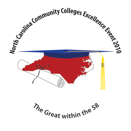
The Great within the 58 logo piece was simultaneously a design assignment in an Illustrator Course, as well as a submission to be considered for use as a conference logo for the annual North Carolina Community College Conference. The objectives were to design a simplistic logo for an annual statewide community college convention, reflecting statewide scholarship.
The magnifying glass is an example of how realistically some inanimate objects may be rendered within Illustrator. These realistic images may serve whatever needed, scaled down as a website icon, an eventual element of a logo, etc. This is an excellent demonstration piece for the versatility of Illustrator.
Strictly Photoshop
Creating within Photoshop
When Adobe first produced Photoshop, I'm sure it was never imagined that variously tensed versions of the program name would become a verb recognized throughout society.
Click to Enlarge

Photoshop is no longer just a program, but the concept of manipulating an image. In most respects that concept is a fittinag and accurate description, as the primary idea behind Photoshop as a singular program is for the user enhance/manipulate a pre-existing image(s). Over time with the improvements release after release Photoshop is a lot more than that, an artistic tool the capabilities of Photoshop are beyond vast. It is the go to program for pixel based work, effective in creating effects of all kinds on photos, photo-touch up and the creation of digital collaborations to name a few common uses.
Strictly Photoshop Design Details
- Carolina Hurricanes™ Animation
- The Good German© Movie Poster
- Wind in Your Sails
- Let it Snow
- Global Girl
The hockey animation is a quick animation created when the Carolina Hurricanes were in contention for the Stanley Cup. This animation was created by utilizing editing tools follwed with the capabilities of the layers panel to enable seemingly realistic movement. Animations such as this one created within Photoshop are best described as digitized flip books; it is set to loop but if you would like to start it from the beginning simply refresh your browser.
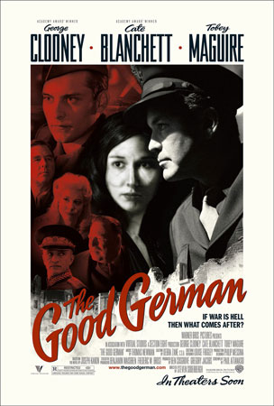
The movie poster piece was a final project for an introductuctory Photoshop course. Within this project each student was tasked with inserting themselves as seemlessly as possible in the place of an actor on an existing movie poster. It's a difficult task to complete on an individual basis when you consider what that task really entails...getting a photo of yourself at the right angle for example. Following some necessary brainstorming and research, I decided to place myself in place of Cate Blancett on the poster for "The Good German."
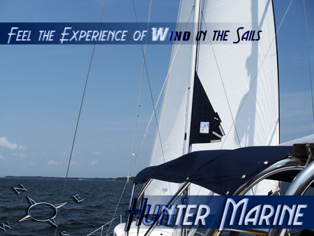
The next piece utilizes a picture captured on "Foxy," (a Hunter Sailboat) to create a speculation advertisement for the Hunter Marine (now Marlow-Hunter) Company. With it experimented with text and layer effects to make the text non-intrusive, wanting the ad to work with/for the image, and stay as far away from a hard-sell tone as possible.
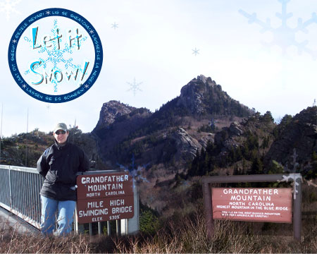
The Let it Snow rendering is an example of how if done correctly Photoshop can be effectively utilized to almost seemlessly combine multiple unrelated or semi related images (four or five in this example) into one over all picture. It also utilizes the snowflake shape in various sizes with different blend settings to unify the whole piece. This rendering is also another example of using Photoshop to create a single piece to tell a story, applicable fror publicaitions or even family photo albums.
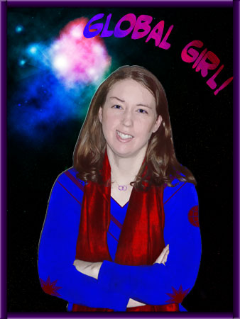
The far right image "Global Girl" was a part of a school assignment, it was a product of being tasked with utilizing certian tools and filters make yourself a superhero while maintaining a good resemblence of where one started. To do this I used the warp tools to exaggerate me expression; the "different" outfit was generated with overlay, colorization, and shape tools/techniques. Followed with the creation of the nebulus background created with various layers and filters within Photoshop.
The work within my Strictly Photoshop gallery is from my earlier design works, as a result of increased knowledge of The Design Suite it is rare to exclusively work within Photoshop anymore.
More to Checkout!
Additional Digital Pieces
While this page contains a large variety of peices created utilizing the computer, it does not feature all of my pieces that have been created with the assistance of the computer. More logos can be found on my Logos and Collateral Packages page, and some examples of photo restoration are located on my Photography samples page. Please check back often as I will post more work over time.